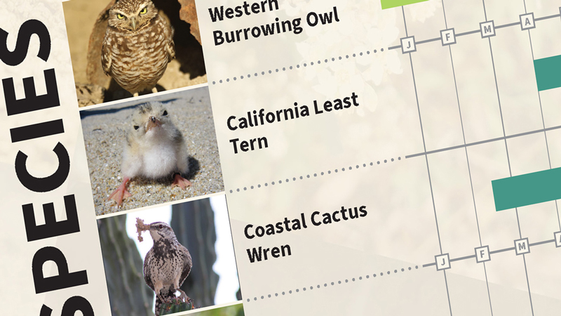
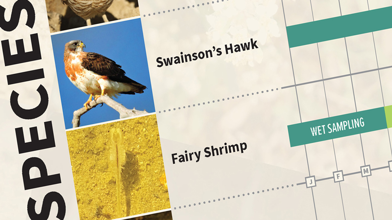
Infographics
Most research tools assessing extreme weather and its effects are designed for use by scientists and researchers, making it difficult to implement them in planning and routine decision-making processes. Graphic design and visualization, however, can have a considerable impact on how effectively information is understood, thereby improving accessibility and communicability of complex topics such as climate change. Information that is presented in a visual way enhances a decision maker’s ability to process complex information and can help explain information more effectively to internal and external stakeholders.
The infographic below can help you decide on which tools to use in order to visualize your climate risk.
 Download the infographic for the links to each tool.
Read more about helpful tools on our blogposts on extreme heat, extreme precipitation, sea level rise, and drought. To learn more about how we can help assess and mitigate risks, please visit our Risk + Resilience page.
Source
Harris & Associates
Markets
Municipal
Planning + Development
Public Works
Services
Risk + Resilience
Community Planning
Climate Change + Sustainability
Categories
Climate Adaptation